Your LinkedIn company page banner is one of the first things visitors see when they enter your page, creating a great opportunity to capture their attention with stunning visuals and powerful messages. With all the content that users see every day on social media, marketers have to always look for ways to stand out and deliver consistent branding.
We looked at how some of the most engaging brands on LinkedIn are using their company page banners and highlighted 9 creative things you can do with yours. (Bonus: these examples are great for B2B marketers as well!)
1. Coca-Cola Collage
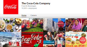
Coca-Cola delivers not 1 but 11 images highlighting their diverse customers and the idea of sharing a coke with your community. They also made it timely for the U.S. audience that just entered the Summer season and will soon celebrate July 4th.
Marketers should definitely consider using a collage for better storytelling. But they should also make sure that the message doesn’t get lost because there are too many images or because the images don’t seem to be related. Marketers should also remember that most users are on their phones and make sure that the images in the collage are still legible on the smaller screens.
2. Google’s Mascot
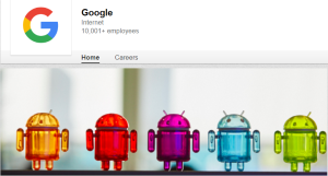
Bugdroid, the green android mascot, is displayed in different colors in Google’s LinkedIn banner. The image is simple but very colorful and playful. It’s consistent with Google’s brand and its colors. Google uses this type of colorful imagery throughout their LinkedIn page, which probably helps keep their audience engaged.
Marketers should consider displaying their company’s quirky mascot, logo, company pets, stuffed animals, etc. It is a fun way to show your brand’s personality on LinkedIn.
3. Inc.’s people
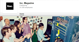
Inc. Magazine’s banner image is (presumably) highlighting their most valuable assets- their employees. It looks like a fun place to work, which can help attract job applicants.
B2B marketers can use images highlighting their employees to not only attract new hires but also to make their brand more relatable for potential customers. Customers can have an idea of the cool, smart people who will deliver the best services your company has to offer.
4. HP’s slogan and products
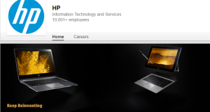
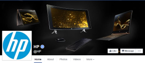
HP demonstrates how it “Keep[s] Reinventing” its products with its latest innovative product. The side-by-side, splashy images help users get excited and curious about their new product.
Brands can use their LinkedIn banners to highlight new products and their exciting features.
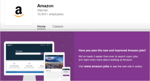
5. Amazon’s job website
Even though Amazon maintains a steady presence on LinkedIn, they have their own job board that they want applicants to use.
Marketers can use the banner to announce new website features, which sparks curiosity, and to drive traffic back to a platform that you own and have more control of.
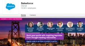
6. Salesforce Events
Are you planning to host or participate in a big conference, trade show, webinar, or interview? Take advantage of the page banner to promote it. LinkedIn is for professionals looking for ways to learn and grow professionally. So this is precisely the type of content that they will be interested in.
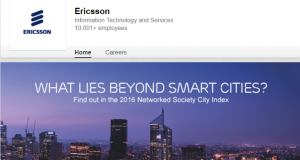
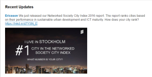
7. Ericsson’s Latest Report
Ericsson combined their banner image and pinned post feature to promote their latest report. Any interested users can quickly find the link and click-through to their website to download the report. This is another example of ways to use the banner image to drive traffic back to your website.
8. Siemens’ Cross-Promotion
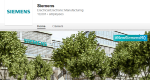
Hashtags don’t work on LinkedIn. But Siemens has 1 million followers on LinkedIn, 90 thousand followers on Twitter, and 365 thousand followers on Facebook. Therefore, this is probably part of a smart effort to drive their LinkedIn audience to Twitter and Facebook.
9. Twitter Inspires and Cross-Promotes
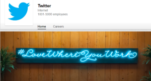
Twitter wants to drive users back to twitter (…of course) with an inspirational hashtag that fits right in with the “professional network”.
Even though we focused on LinkedIn, you can use any of these tactics on your other social channels. In fact, most of the brands mentioned above used the same images on their other channels. There are some small modifications that you should keep in mind- for example, on a desktop screen, Facebook and Twitter’s banner image gets cropped by the profile image. Notice the position of HP’s slogan in the different channels.
Watch out for the “like” and “message” buttons.
And there you have it, 9 ways to optimize your banner to cross-promote, provide consistent branding, educate users about your product and people, and/or inspire users.
Overdrive Interactive is an award-winning digital marketing agency that helps leading companies compete and win in the online space. Founded in 2001, the agency has developed into an integrated digital shop that delivers brand building, customer acquisition and lead generation programs utilizing search marketing, social media marketing, online media buying, analytics and world class creative services.


