Introduction
Internal site search is often a heavily-used feature of websites and is important for a good user experience.
Sites with extensive content, such as enterprise-level businesses, can be an overwhelming navigational experience for first-time visitors. These users are often at the beginning of the conversion funnel, and a site search can bypass prolonged browsing in the main navigation.
Time and usability are of the essence.
Ever visit a site and not know where to begin? You’re not alone. Getting information to the user quickly helps move them further into the conversion funnel and maintains their attention on the site.
Site Search Design Study
A Viget.com study presented in January 2015 tested the effectiveness of various search designs on WRAL.com. Viget wanted to know if users would be able to locate and use the simple, hidden design that expands into a box when clicked.
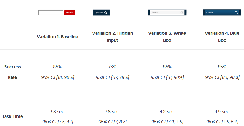
The hidden design is immediately below in GIF form, and it’s also Variation 2 in the chart below.
The study found that search designs with a visible box had similar success rates. Strikingly similar in fact.
As for the hidden design, while it looks cool and is minimalist in nature, it had a significantly lower success rate in the study and took nearly twice the amount of time to locate and use.
Viget concluded that the most-recognized icon for search isn’t just a magnifying glass, but a wide rectangular box. In my opinion, this is the design most of us are accustomed to as it’s intuitive that you should be entering your search query into a box.
Design Recommendations
The purpose of this post is mainly to present an interesting study on internal site search design, but also offer some guidance on how to optimize the look and feel of your own search feature. Talk to your web development team about how these practices and designs should be applied.
Many sites nowadays are employing a design like that of Variation 2 above, typically located somewhere above or within the main navigation. And then when the magnifying glass icon is clicked, a search box appears for the user to enter text.
This may not be the best choice.
Based on the results of the Viget.com study, you should consider employing the search feature to reflect the most salient representation of keyword search – a rectangular search box – like Variations 1, 3, or 4 above. Doing so will help users quickly recognize the site search feature and encourage interaction on your site.
Overdrive Interactive is an SEO company in Boston that drives measurable ROI. Our search engine optimization programs not only drive natural search traffic – they connect prospects to high quality user experiences that encourage desired behavior. Our SEO services and the resulting search engine presence connects visitors to content that satisfies their needs. As an award-winning Boston SEO firm, we are passionate about your success!


