Strategy First.
Growth Follows.


Beyond
the Agency Model
Overdrive has always worked as a strategic partner, not a vendor. We start with understanding, design strategy before activation, and bring channels together as one system. While many agencies lead with services, we focus on uncovering the right answers first. This approach creates clarity, alignment, and smarter growth in an increasingly complex marketing landscape.
The Traditional Agency Model
- Leads with predefined services
- Optimizes channels in isolation
- Reports on results after the fact
The Overdrive Approach
- Begins with discovery and insight
- Activates strategy across integrated capabilities
- Uses intelligence to guide ongoing improvement
We bring structure to this approach through a simple, proven model that moves from Discover to Strategize, Activate, and Optimize.
Our Core Capabilities
.gif)
.gif)


Why Marketing Leaders
Choose Overdrive
A strategy-led approach built for smarter decisions and sustained performance
Marketing Leaders partner with Overdrive when marketing becomes harder to navigate, harder to measure, and harder to align across teams. They’re not looking for more tactics or disconnected services. They’re looking for clarity, confidence, and a smarter way forward.
Our approach helps marketing leaders make better decisions by understanding what truly drives performance and activating with purpose.
Strategy Before Activation
We don’t rush to channels or campaigns. We start by uncovering insight and defining priorities so every action serves a clear purpose.
Integrated, Not Siloed
Paid, organic, analytics, and advanced capabilities work together as one system, not independent programs competing for attention.
Measurement That Informs Decisions
Data is only valuable when it drives action. We focus on intelligence that helps leaders decide what to do next, not just report what happened.
A True Extension of the Team
We work as strategic partners, collaborating closely with internal teams and leadership to solve problems, not just execute tasks.
Featured
Case Studies


Our Core Differentiators are
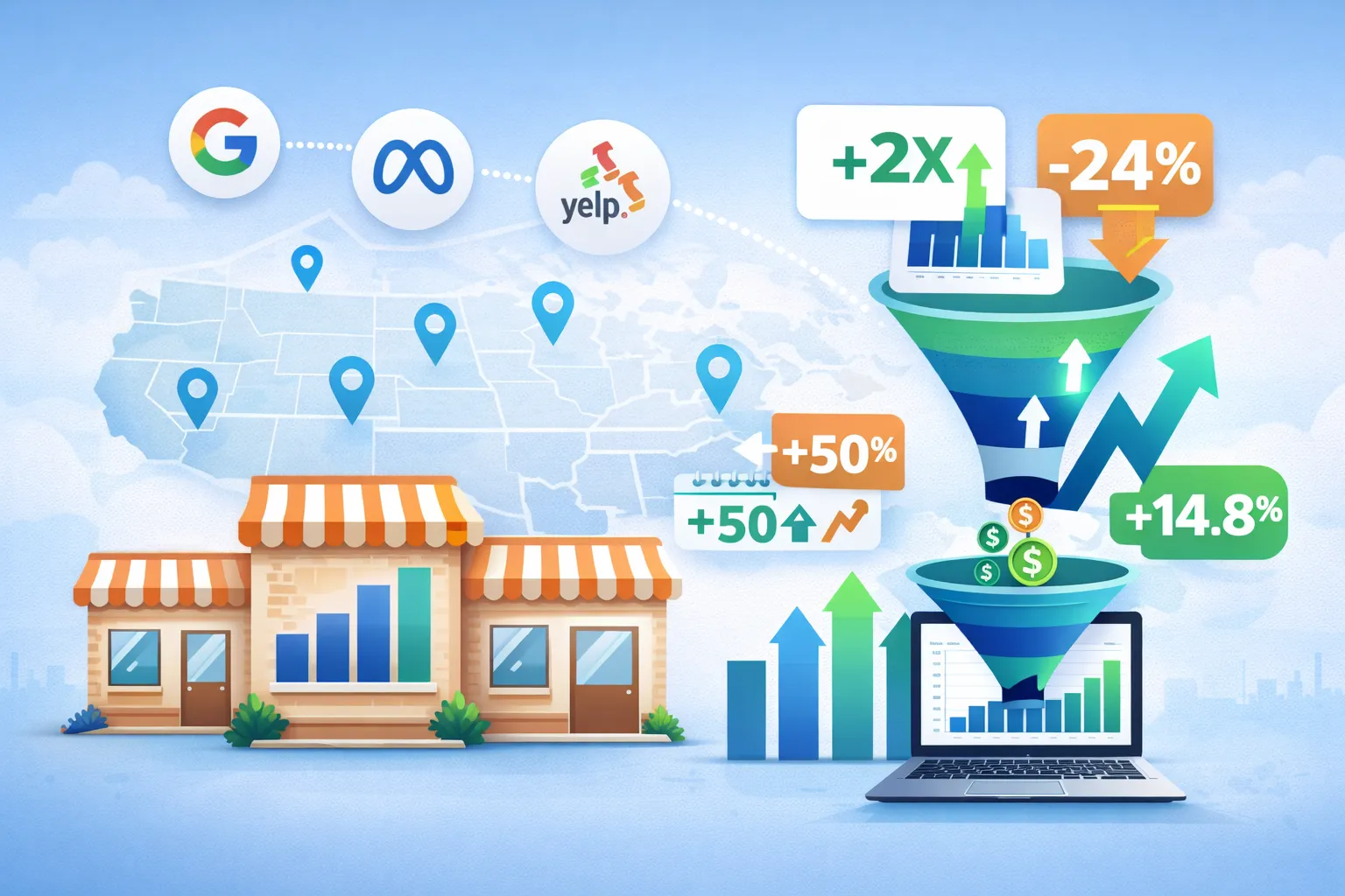
Our precision media targeting ensures your brand shows up at the exact moment of consumer intent—whether for 5 locations or 5,000.
We challenge the status quo to find smarter, faster, and more effective solutions. No cookie cutters, no comfort zones—just smart, scrappy thinking.
We fuse storytelling and conversion science to drive both awareness and measurable ROI. Creative that builds brand equity and drives revenue.
We care deeply about our work, your goals, and your growth. Our teams are built to feel like an extension of yours.
We help you get more from your budget through smarter tech stacks, streamlined media management, and integrated reporting.
We don't just deliver—we own outcomes. Transparent communication and clear ROI are baked into every touchpoint.
Ideal
Client Fit

Marketing Leaders Seeking Innovation
Marketing leaders frustrated by cookie-cutter agency models who want a partner that brings fresh thinking to every challenge.

ROI-Focused Organizations
Organizations seeking measurable ROI across both branding and performance campaigns with clear reporting and accountability.

Challenger Brands
Challenger brands looking to punch above their weight and compete effectively against larger competitors with bigger budgets.

Multi-Location Brands
Multi-location or franchise brands looking for local reach with national consistency and efficient scaling of marketing programs.
Trusted by
loyal customers
"Overdrive is always looking to support me and find proactive ways to drive more value!"
Katie Helper
Vice President, Brand Strategy and Integration
"Overdrive is an easy team to collaborate with! They possess great skills and a great understanding for the work they do!"
Kyzmen Wood
Marketing Manager

"I would 100% recommend Overdrive to any enterprises looking for SEO help. They know SEO and they know how to get results. They're also great to work with. We love the support Overdrive provides us."
Devan Ciccarelli
Senior Content Writer

"Great team; very attentive; subject matter experts."
Norah McDonald
Chief Marketing Officer


