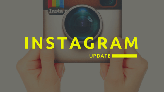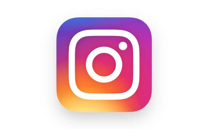
On Wednesday, May 11, 2016 Instagram published a brand new logo accompanied by an app redesign. The vintage Polaroid inspired camera is gone, replaced by a minimalist line design on a rainbow gradient field. Instagram’s accompanying apps, Boomerang, Hyperlapse, and Layout all echo the new color scheme and minimalism.
Inside the app, the redesign includes “simpler design [to] put more focus on your photos and videos without changing how you navigate the app”.
Over 400 million users share 80 million photos per day on Instagram, so there has been the usual shouts of outrage in the Twitterverse (and a few exclamations of joy, too). We’re excited to see how the app continues to develop, especially in terms of advertising and the shift to an algorithm-fueled timeline.
New Instagram logo got us like https://t.co/SrGPoJx1bX
— Bleacher Report (@BleacherReport) May 11, 2016
Instagram just changed their look. Why? 😒
— Danielle Brooks (@thedanieb) May 11, 2016
anyone else think that @instagram's new branding looks like @LisaFrank? #90skid pic.twitter.com/XuWKddUbzt
— Carly A. Riordan (@carly) May 11, 2016
Read Instagram’s official announcement post here, and don’t forget to check out our Twitter poll asking our audience how they really feel about the update:
What do you think of the new @instagram #logo and #app redesign? #Instagram #SocialMedia
— Overdrive Interactive (@ovrdrv) May 11, 2016


