PLEASE READ: From April 8-April 22, 2014, Twitter rolled out a new design. See the blog post about the new design here, and visit https://www.ovrdrv.com/twitter-design-guide to download the new guide.
Are you a marketing professional who is interested in learning about Twitter design? If so, Overdrive Interactive’s Twitter Design Guide is a great resource for you. The guide is available on our Facebook page and on our website, at https://www.ovrdrv.com/twitterdesign.
This guide discusses the major design elements of a Twitter channel, including:
- Profile photos
- Headers
- Bio
- Background images
- Background colors
- Link colors
- Mobile considerations
- And more
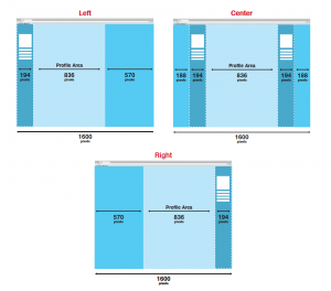
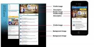
Each element is broken down with specs, best practices and visual examples. Readers will learn how to create pages that are well organized, mobile-compliant and visually appealing. Topics explored include selecting the right photograph that will blend with your profile copy, left aligned verses center and right aligned background images and character length of descriptions.
The result of reading this document will be the ability to design a Twitter page on which critical information is visible and your brand or personality is properly presented to the user. This guide is a must-have for graphic design and brand building teams who wish to project the right image for their organizations.
Harry Gold, CEO of Overdrive, said, “This guide was developed because many of our clients were asking for an easy-to-follow document that quickly and concisely laid out the specifications and best practices related to designing their Twitter channels.” He continued, “This information enables marketers to create profile pages that are more visually appealing and will attract and retain the attention of their followers and prospects alike.”
Here are some visuals from the guide:
Get the guide at: https://www.ovrdrv.com/twitterdesign


