Website Redesign

Website Design
Summary
Carlisle Wide Plank Floors came to Overdrive to redesign their website customer journey to better explain the different design and purchase options to customers for their dream floor. As users cannot purchase through the site but rather are encouraged to have consultation calls, the site needed to set them up for this experience.
- User Experience
- User Interface
- Strategy
- Responsive Web Design
- Web Development
Wireframe
Working with the Carlisle team, multiple wireframes were developed in order to bring the floor purchase journey to life on the homepage.
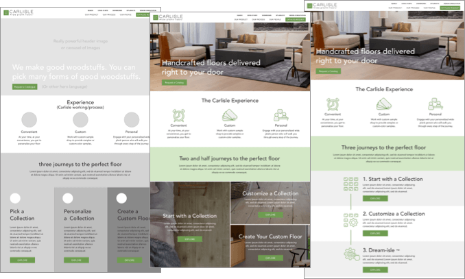
Customer Journey Optimized Language
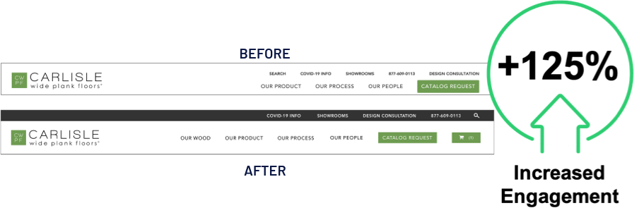
As it was the priority to explain the shopping experience along with the differentiator for Carlisle floors, language was updated in the header from “The Finest Wood Flooring Handmade By American Craftsman” to the more direct, “Handcrafted floors delivered right to your door”. Additionally, naming conventions for the navigation were adjusted to be more CTA-focused.
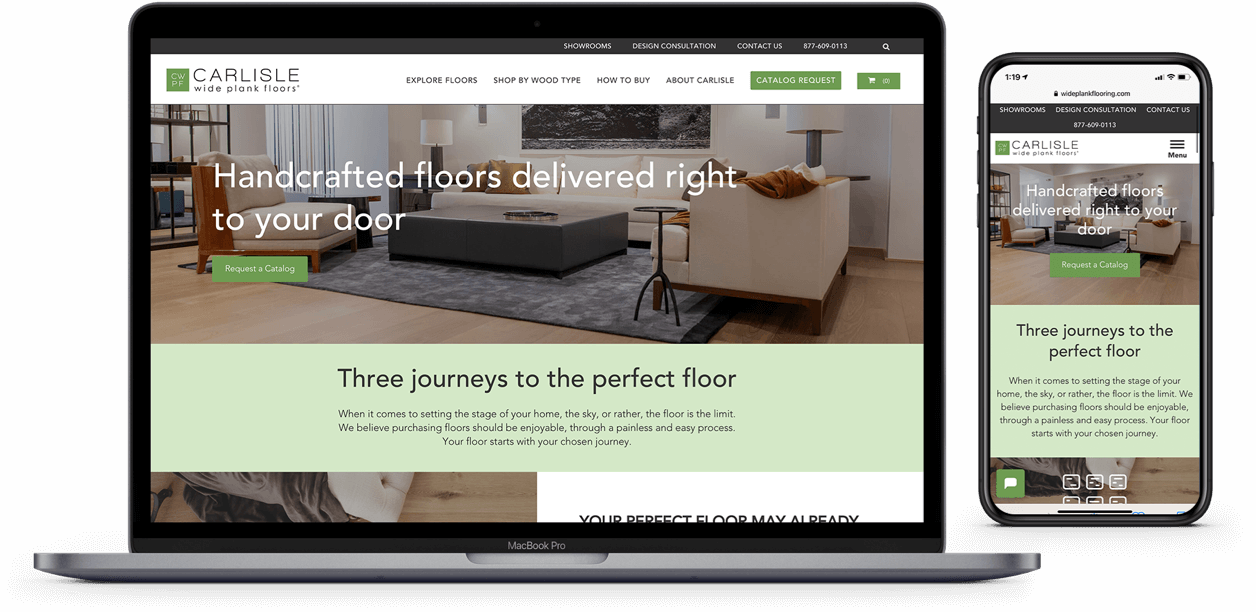
Homepage Redesign
The design of the homepage was revamped to prioritize clear and simplified explanations for the product options and CTA entry points to entice users to explore the three options for designing their floor.
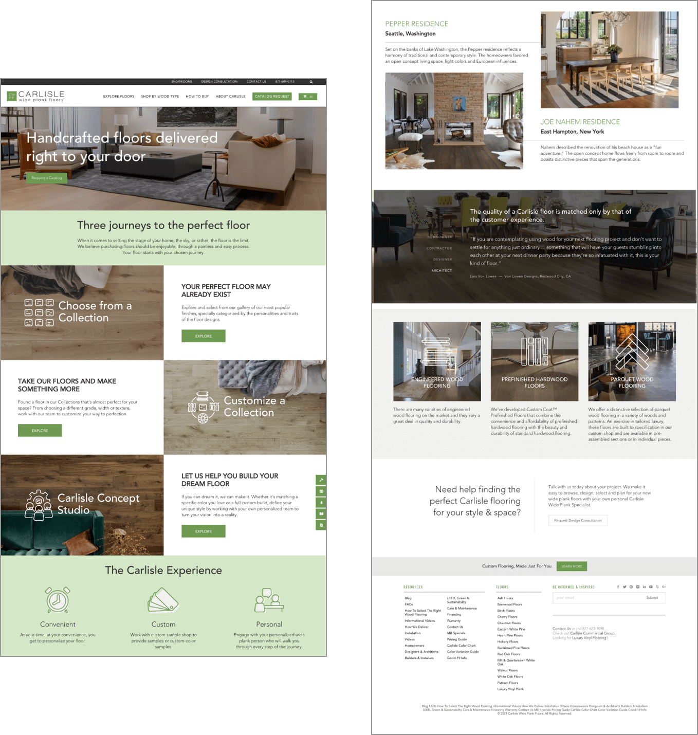
Customer Journey Touchpoints
CTA entry points were added throughout the customer journey experience so users could easily navigate between the Collections page, Customize page, and the Carlisle Concept Studio.
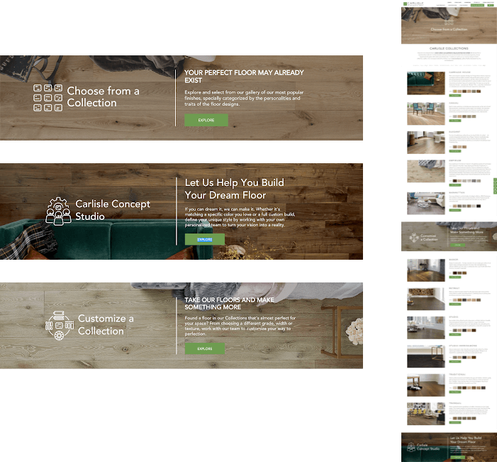
Measured Success
The just-redesigned navigation dramatically increased engagement with “How to Buy” by 125%.
Launch


