Website Redesign
Website
Summary
Goltens was looking for an agency that could give them a creative boost and bring their 80+ year old company into the 21st Century. Overdrive was able to create something capturing without intruding on the existing brand.
- User Experience
- User Interface
- Strategy
- Web Guidelines
- Responsive Web Design
- Web Development
Design
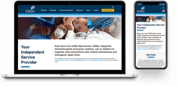
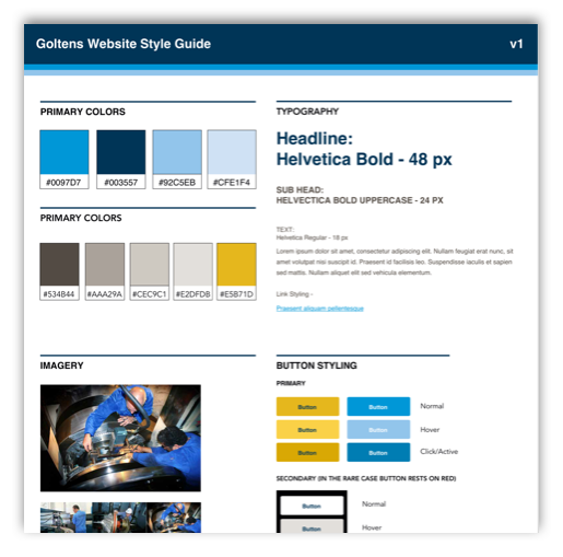
The design focused heavily on the existing photo library, letting the photos of engineers working on the massive engines do the majority of the talking. Overdrive opened up the palette of their original colors to include a wider range of blues and used the grouping as a theme throughout.
Site Map & Wireframes
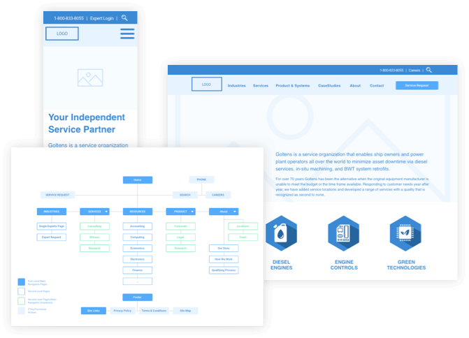
Overdrive took the existing site map and gave it a revamp, paying close attention to the needs of existing users and keeping what worked while also getting rid of what didn’t. A full-featured, responsive wireframe was created to get approval on the overall structure and function of the site before implementing design.
MarTech Integration
Overdrive’s development process ensured smooth integrations for the client’s MarTech stack (marketing technologies), as well as making it easier for the client to edit pages and create new ones using tools that dramatically speed up the process.

Elevated Photography + Typography
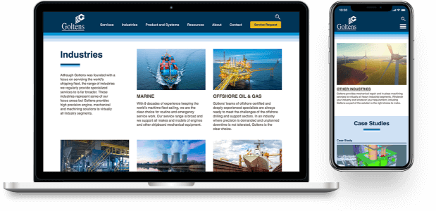
In addition to existing photography, Overdrive implemented an array of industry-specific images to quickly visually convey the services Goltens provides. Additionally, Overdrive created different simple, yet effective grids for the typography.
Consolidated Back End
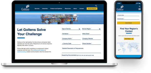
Goltens original back end, like a lot of older sites, needed some work. Overdrive organized and simplified the user experience behind the scenes, to increase efficiency and ease of future updates.
Web Guidelines
Overdrive created a design system to direct anyone making edits or updating the site in the future in order to help ensure the changes were brand-safe.
Launch


